2021 | LOGO | BRAND IDENTITY
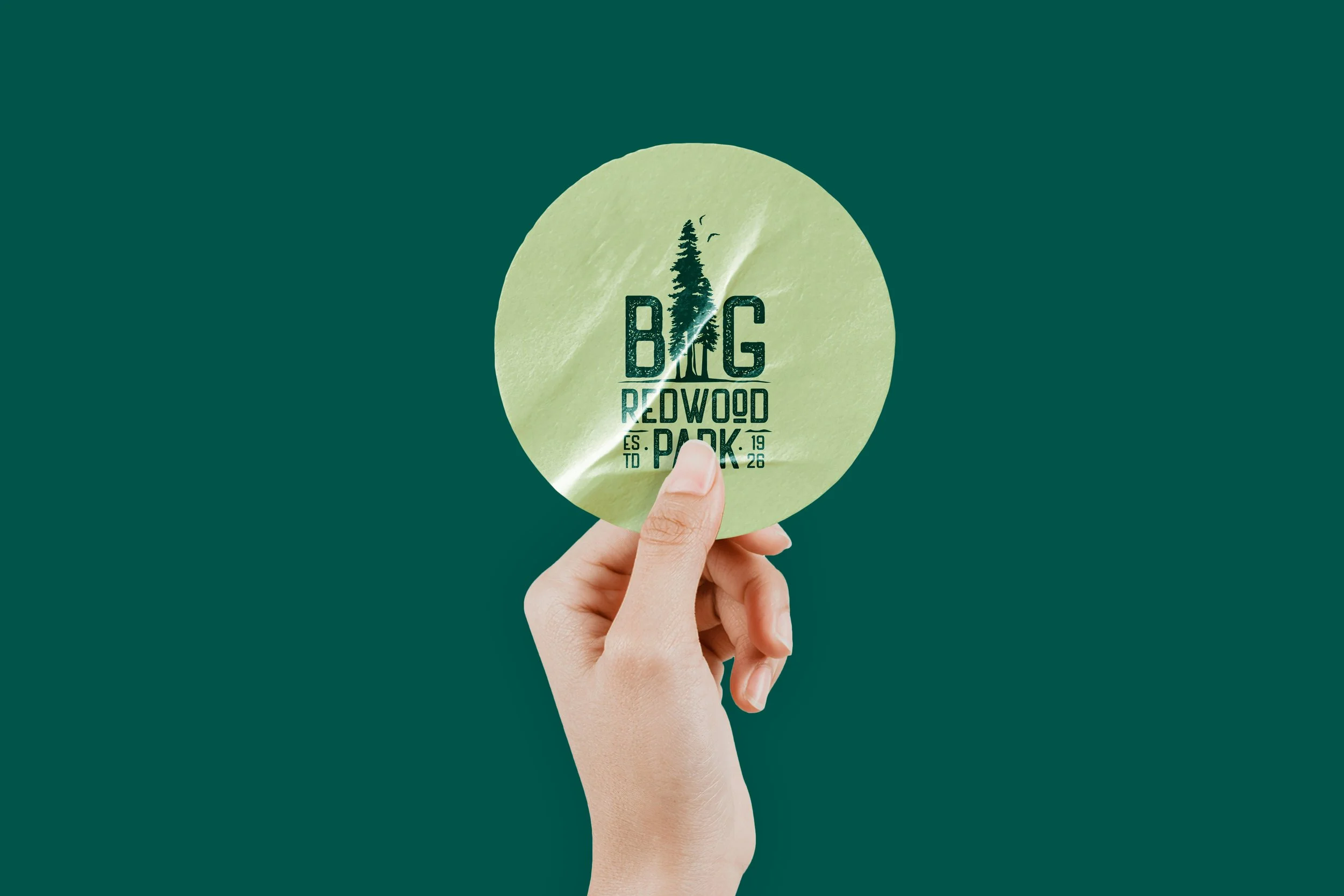
Big Redwood Parks is a residential community in Los Gatos, California, established in 1926 and surrounded by the natural character of the redwood landscape. Humind Creatives developed a new logo and brand identity system that brings together the community’s history, environment, and welcoming sense of belonging.
THE CHALLENGE
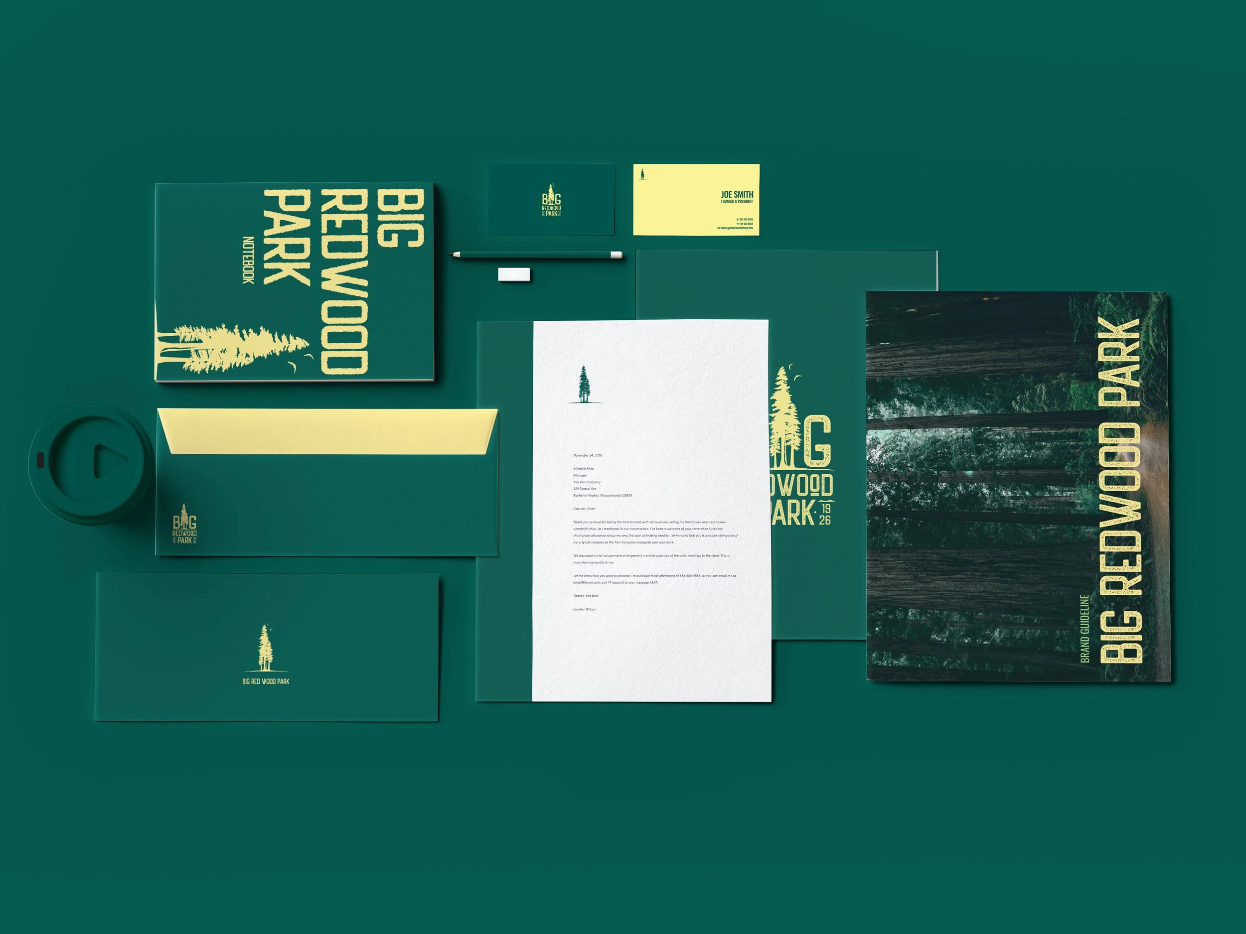
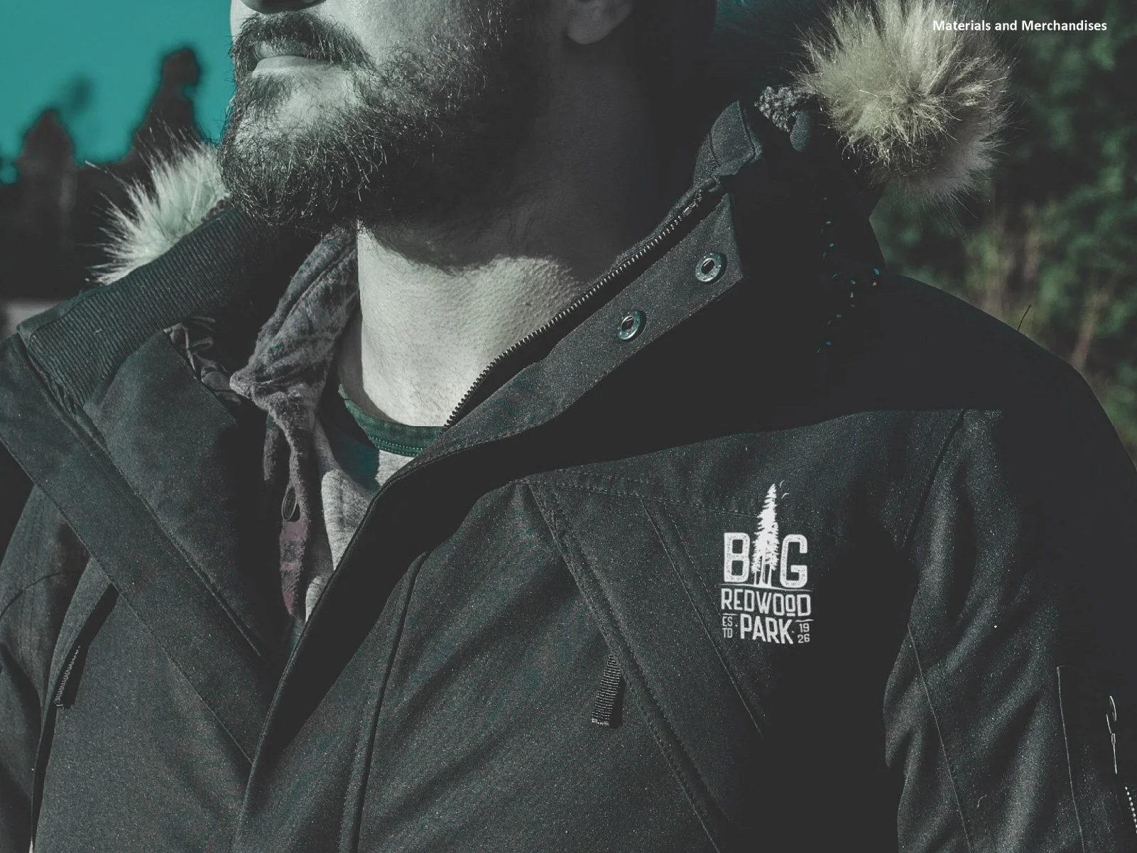
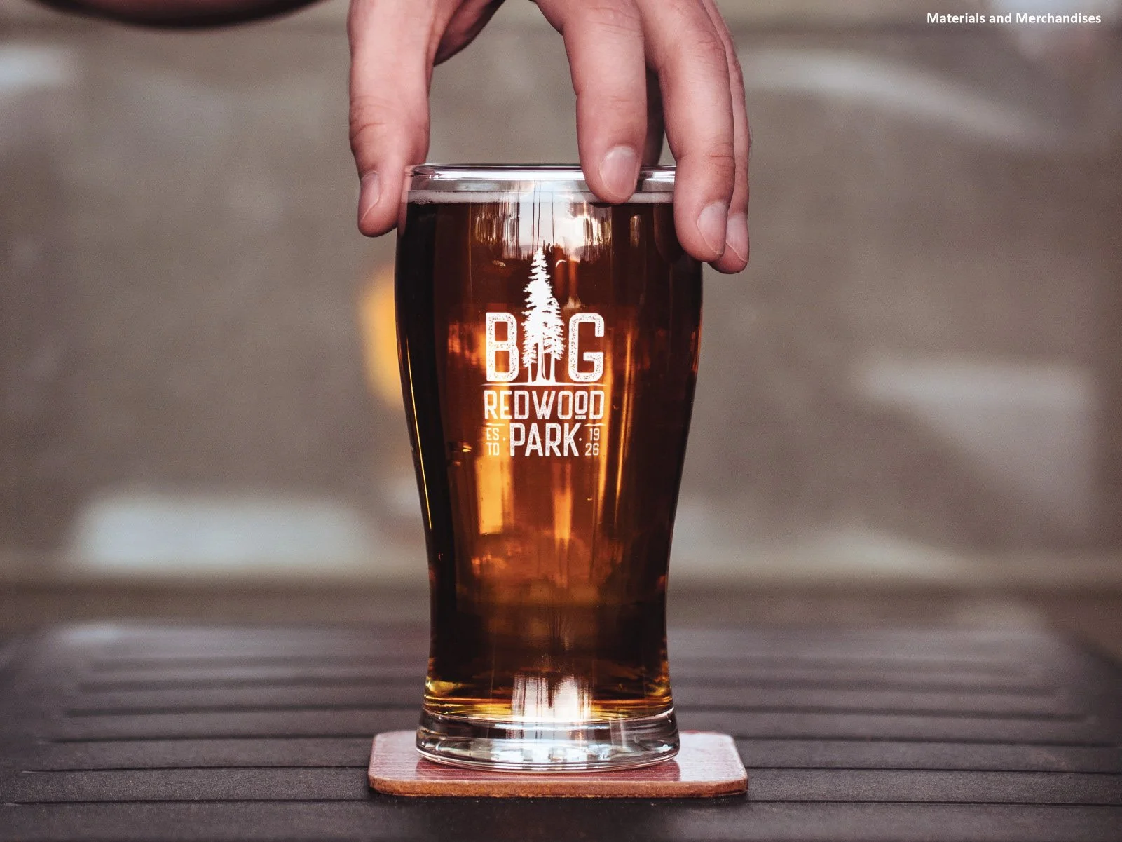
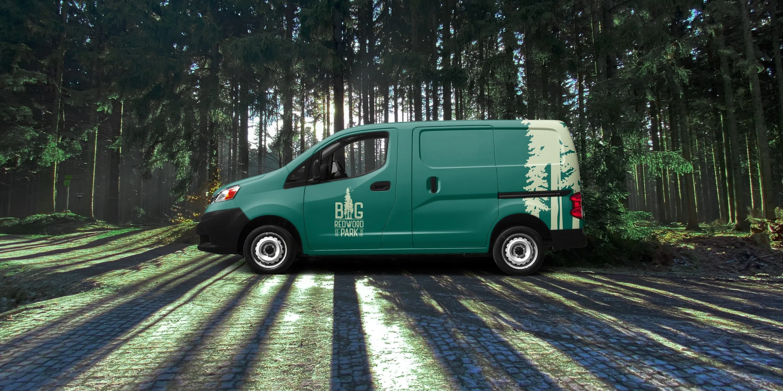
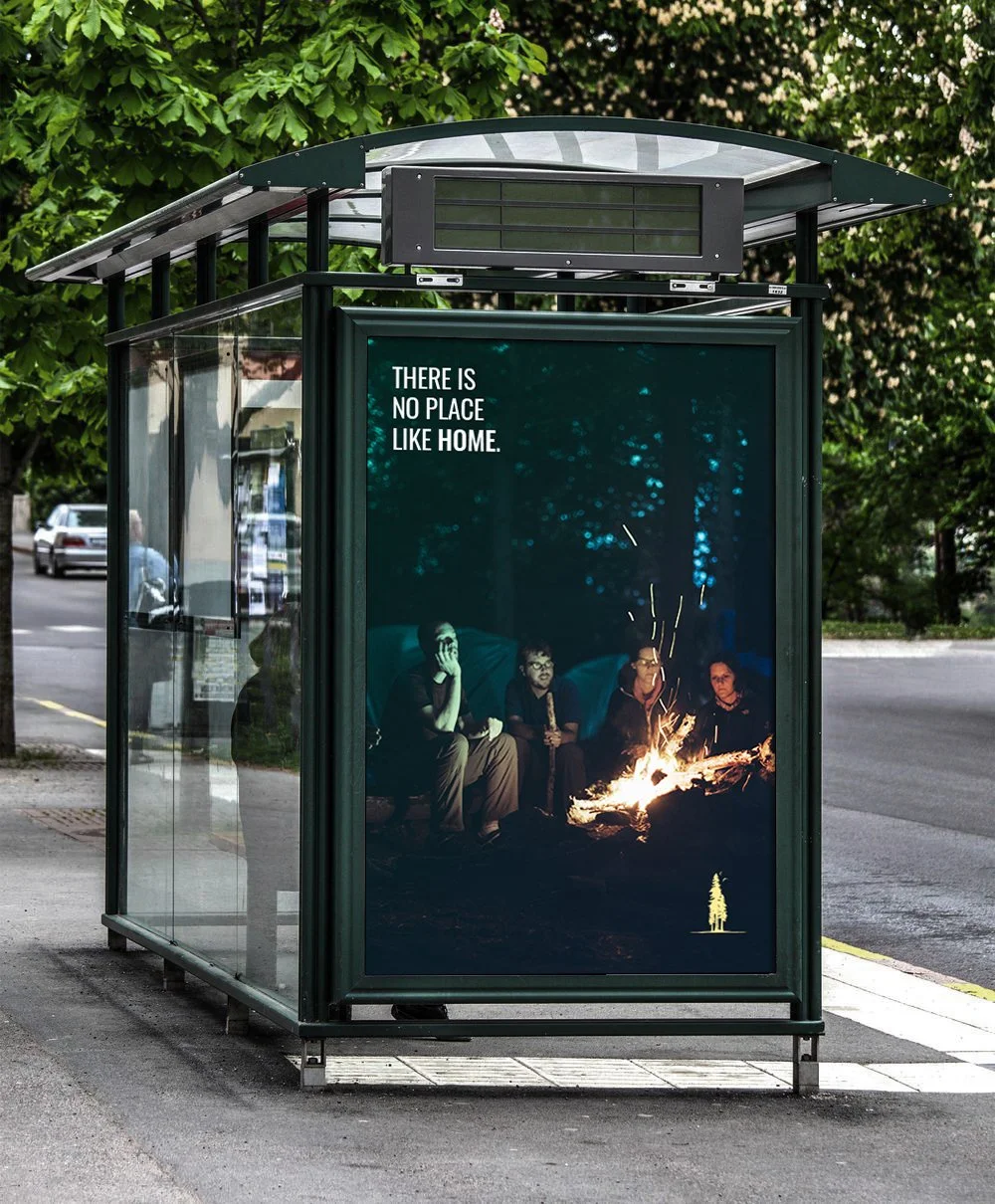
The challenge was to create an identity that felt rooted in the community’s long history without appearing dated. It needed to reflect the strength and scale of the coast redwoods while also communicating a warm, peaceful, and close-knit place to live. The system also had to remain recognizable and consistent across different formats, from small digital icons to communications, apparel, merchandise, and community materials.
THE RESULT
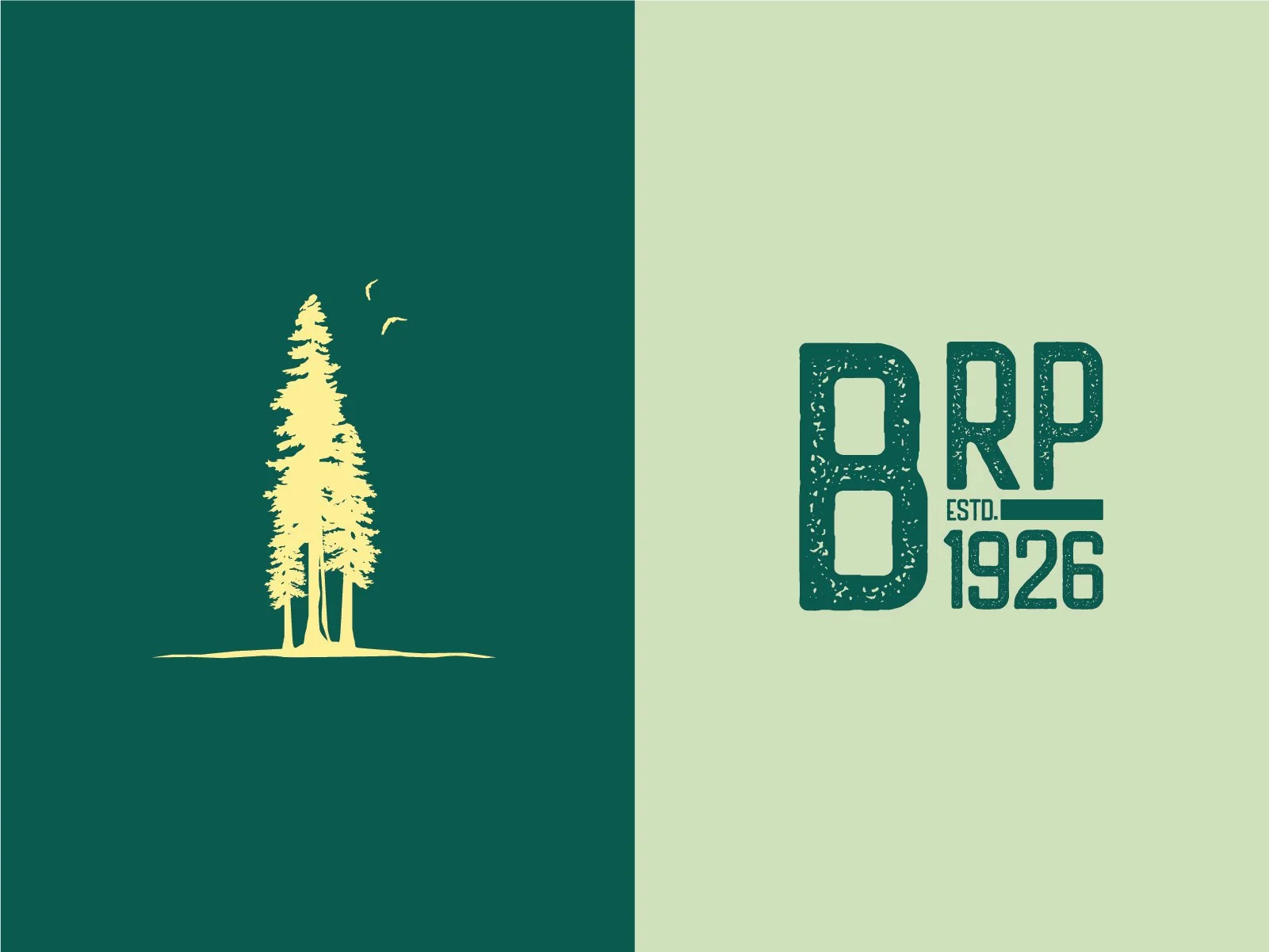
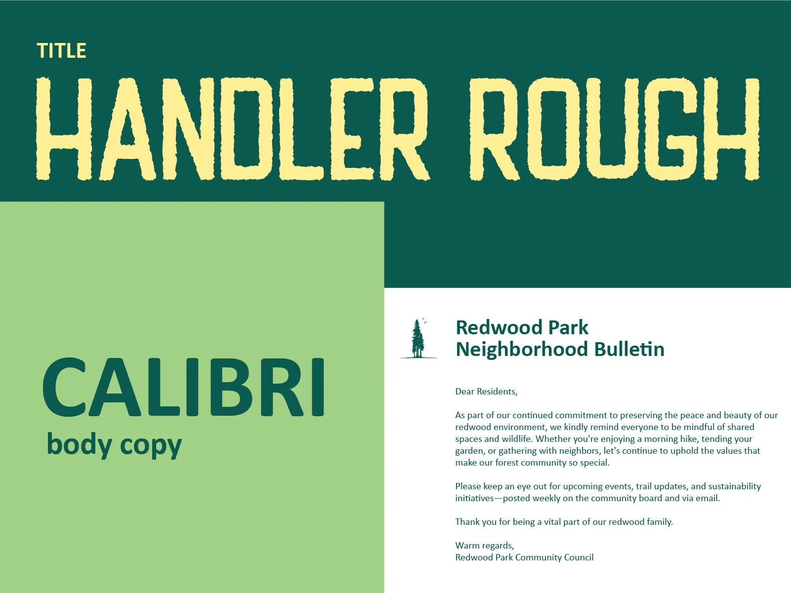
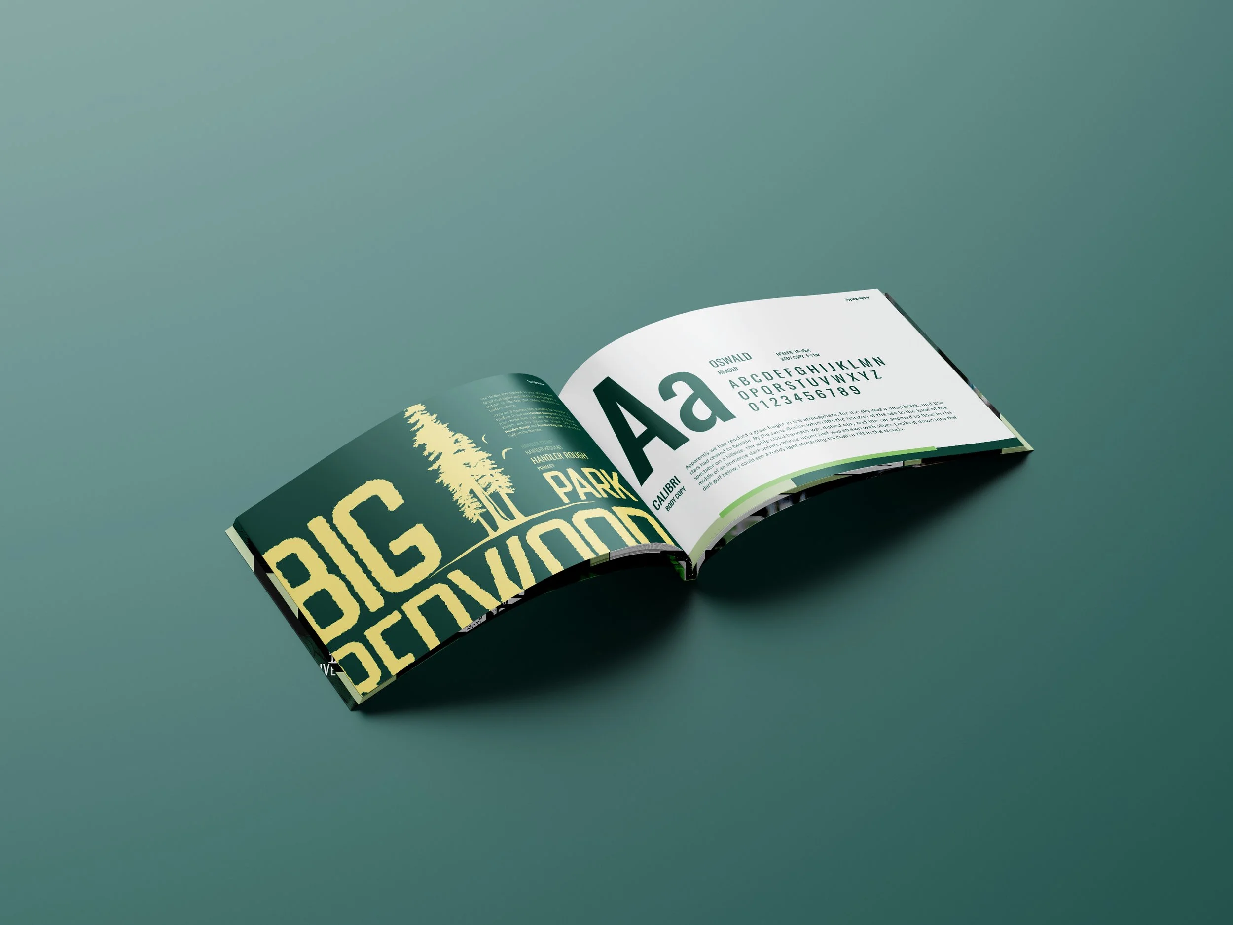
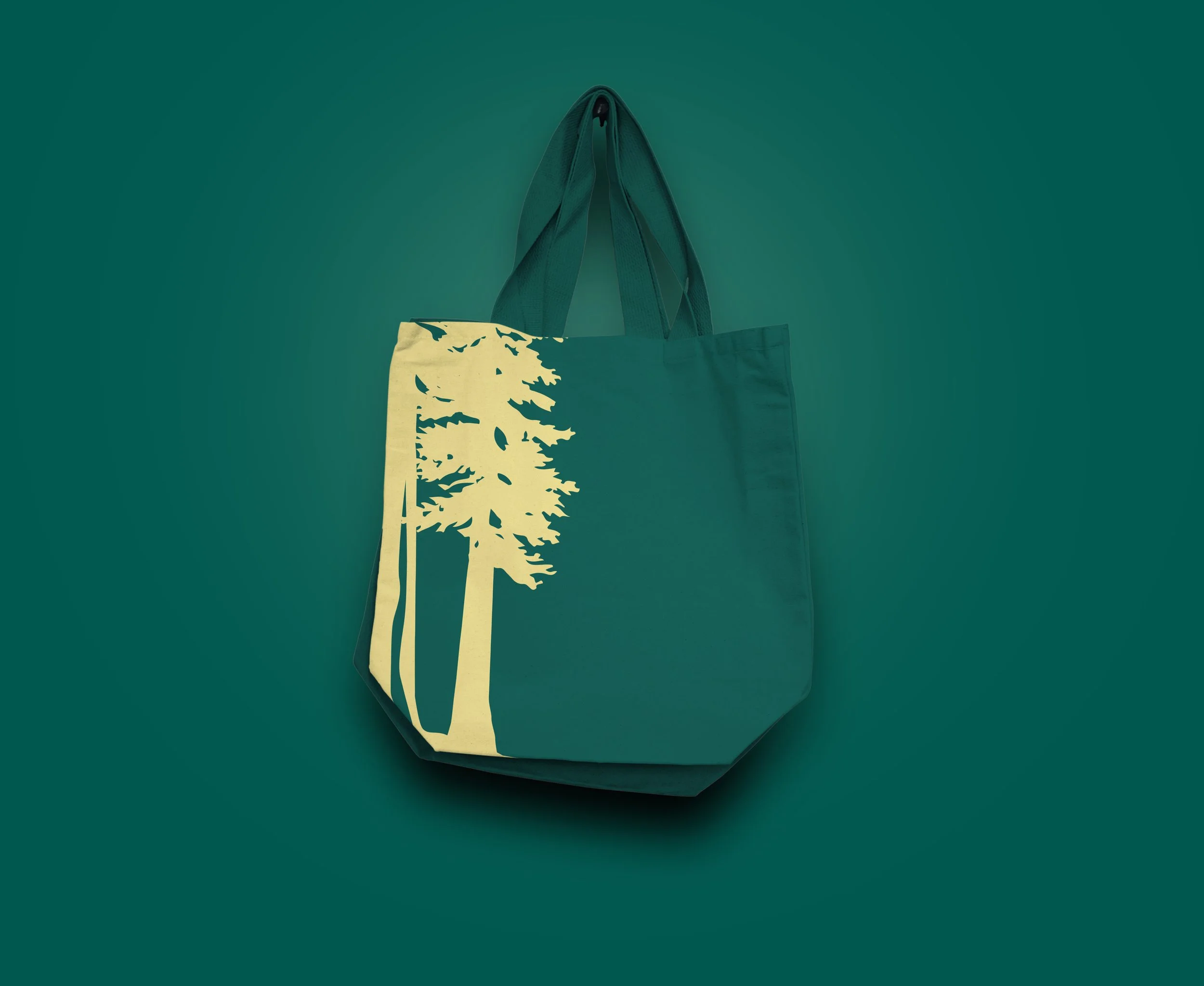
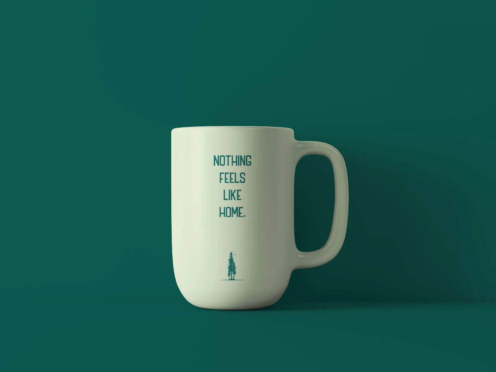
The final identity places the redwood tree at the center of the logo as a symbol of growth, longevity, and connection. Textured typography gives the mark an established, natural character, while the forest-inspired color palette reinforces the community’s surroundings. Supporting logo variations, typography, imagery, color standards, and usage guidelines created a flexible system that can represent Big Redwood Parks consistently across print, digital, and physical applications.